

Turning a Figma design into a live WordPress website involves more than copying colors, fonts, and layouts. A successful Figma to WordPress project requires a clear development workflow, responsive layouts, optimized images, accessible content, and thorough testing.
With Elementor, developers can recreate approved designs using a visual editing interface while giving clients a practical way to manage their website content. The key is to plan the structure before building and test the result across different devices.
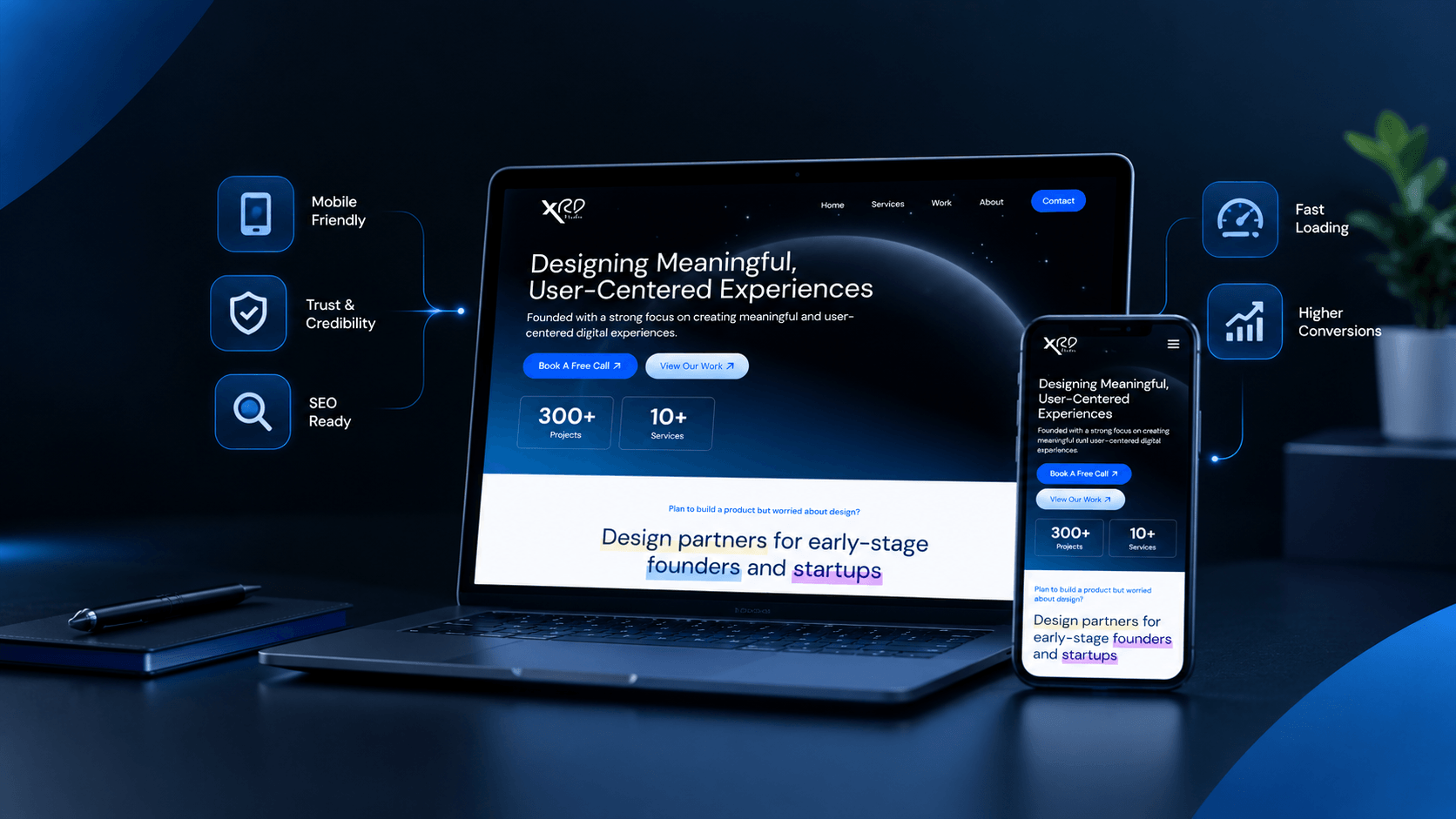
In this guide, you will learn how to review a Figma file, prepare WordPress, recreate the layout in Elementor, improve responsive behavior, and check the website before launch.
1. Review the Figma Design Before Development
Before opening WordPress, review the complete Figma file. Understand the page structure, repeated components, visual hierarchy, image requirements, and interactions expected in the final website.
A design file may include multiple desktop layouts, mobile screens, reusable components, and alternative design concepts. Reviewing these details first helps reduce unnecessary revisions during development.
Start by identifying:
- Page structure: Headers, hero sections, service blocks, project galleries, forms, and footers.
- Typography: Font families, sizes, weights, line heights, and heading hierarchy.
- Colors: Brand colors, background shades, borders, and button states.
- Spacing: Container widths, padding, margins, and gaps between elements.
- Assets: Logos, illustrations, icons, photographs, and background graphics.
- Interactions: Navigation menus, tabs, sliders, hover states, and form behavior.
Check whether mobile and tablet layouts are included. If they are missing, establish how the design should adapt at smaller screen sizes before development begins.
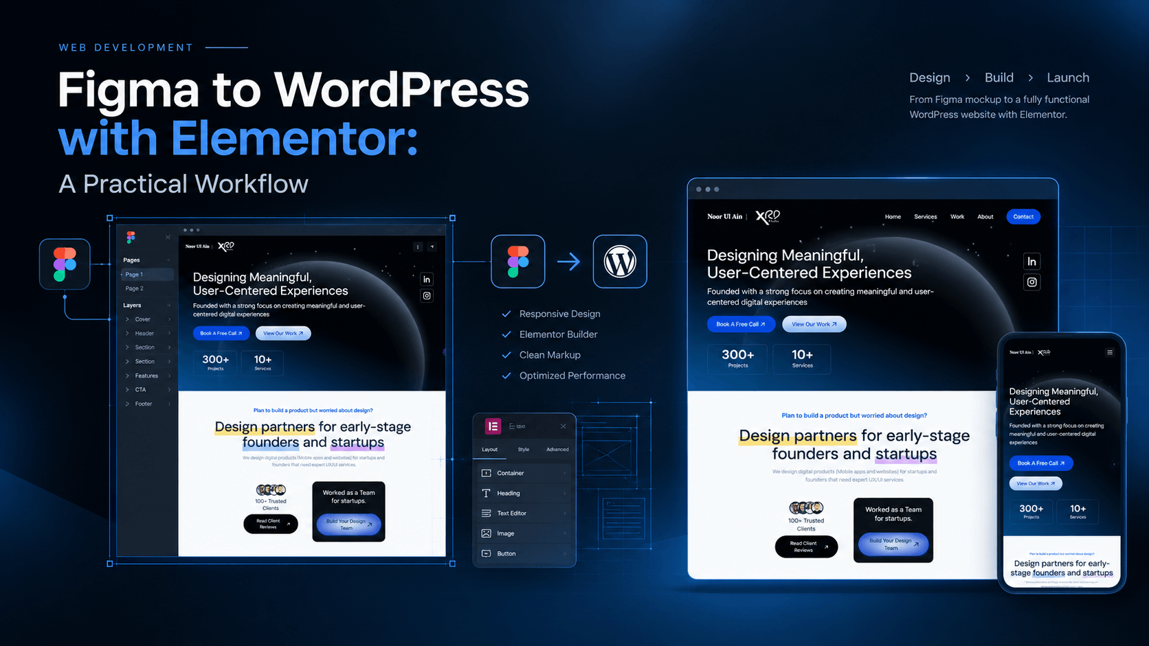
2. Prepare WordPress and Elementor
Once the design requirements are clear, prepare the WordPress environment. Use a staging site or development environment whenever possible, particularly when working on an existing business website.
Before building the page:
- Install WordPress and confirm that the hosting environment is working correctly.
- Choose a lightweight theme that suits the project requirements.
- Install Elementor and Elementor Pro only if the required features need the Pro version.
- Configure the site title, permalink structure, and essential WordPress settings.
- Organize required plugins and remove unnecessary dependencies.
- Set up a backup and confirm that the development environment is secure.
Do not install plugins simply because they are popular. Select tools according to the site’s actual requirements, maintenance needs, and performance goals.
You can explore the official Elementor website to review its page-building features and available plans.
3. Set Up Colors, Typography, and Spacing
One of the most useful steps in a Figma-to-Elementor workflow is to establish global styles before building individual sections.
When colors, typography, and spacing are configured consistently, the same design rules can be reused across multiple pages. This also makes later changes easier because shared styles can be updated without manually editing every element.
Define global colors
Identify the primary brand color, secondary colors, text colors, background colors, and border colors in Figma. Add the corresponding values to Elementor’s global color settings.
Configure typography
Document the heading sizes, body text, font weights, and line heights. Set global typography styles and adjust them for smaller screens where necessary.
Standardize spacing
Use a consistent spacing system for section padding, container gaps, buttons, and cards. Avoid assigning unrelated values to every element unless the design genuinely requires a different treatment.
The objective is to recreate the design system, not just individual screenshots. A consistent foundation makes the website easier to maintain as new pages and sections are added.
4. Rebuild the Layout in Elementor
With the global styles ready, recreate the website one section at a time. Start with the shared structure, then move through the page in the same order as the approved design.
- Build the header: Add the logo, navigation, and primary call to action.
- Create the hero section: Match the headline, supporting text, imagery, and button placement.
- Recreate content sections: Build service blocks, feature grids, project galleries, and other page components.
- Use reusable components: Save repeated sections or templates when they will be used across the site.
- Build the footer: Add relevant navigation, contact information, and other required details.
Elementor Containers can help recreate flexible layouts. Use appropriate container direction, alignment, gaps, widths, and wrapping behavior instead of relying on excessive fixed positioning.
For repeated elements, such as service cards or portfolio items, use a consistent structure. If the site needs dynamic content, consider suitable WordPress features and Elementor’s dynamic content options rather than manually duplicating everything.
5. Make the Website Responsive
A design that looks correct on a desktop monitor may not work well on a phone. Text can wrap unexpectedly, buttons may become difficult to tap, columns may become too narrow, and large images may push important content below the fold.
Responsive testing should be part of the build process, not an optional task at the end.
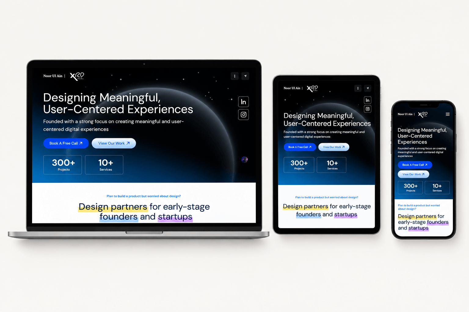
Use this responsive checklist:
- Check the layout at desktop, tablet, and mobile widths.
- Adjust heading sizes and line heights for smaller screens.
- Stack columns when there is not enough room to display them side by side.
- Check button sizes, spacing, and tap targets.
- Ensure images remain proportional and do not overflow their containers.
- Test navigation menus and interactive elements on touch screens.
- Look for horizontal scrolling and content hidden outside the viewport.
Do not assume that the desktop layout will automatically produce the intended mobile experience. Make deliberate responsive adjustments and test the result at multiple widths.
6. Optimize SEO and Website Performance
A visually accurate website also needs a sound technical foundation. Search engine optimization and performance should be considered while building the page, rather than postponed until after launch.
Use a clear heading hierarchy
Use one clear main heading for the page and organize supporting sections with meaningful subheadings. Headings should describe the content that follows instead of being selected purely for their visual appearance.
Optimize images
Compress images and use appropriate dimensions and modern formats, such as WebP where suitable. Write descriptive alternative text for informative images, and avoid adding keywords that do not accurately describe the visual.
Improve page loading
Reduce unnecessary plugins, avoid excessive nested widgets, optimize images, and configure appropriate caching. Test the finished site with tools such as Google PageSpeed Insights to identify opportunities for improvement.
Use descriptive URLs and internal links
Create readable URLs and link related pages where it helps visitors. Service pages, project case studies, and relevant blog posts can support a more useful site structure when they are genuinely related.
Remember that using Elementor does not automatically guarantee strong rankings or fast loading. Results depend on the complete implementation, content quality, hosting, assets, and ongoing optimization.
7. Test the Website Before Launch
Before publishing, compare the completed WordPress page with the approved Figma design. Review the layout at the same viewport widths and identify differences in typography, spacing, colors, image cropping, and alignment.
Then test the site’s actual functionality.
- Check all navigation links and calls to action.
- Submit forms and verify that notifications are delivered correctly.
- Test menus, tabs, sliders, accordions, and other interactive features.
- Review the page on multiple screen sizes and browsers.
- Check image loading, page speed, and unexpected layout shifts.
- Confirm that SEO titles, meta descriptions, headings, and image alt text are appropriate.
- Verify backups, security settings, and the production launch process.
After launch, review the live website again. A page can behave differently in production because of caching, fonts, third-party scripts, or hosting configuration.
8. Common Figma-to-WordPress Mistakes to Avoid
Rebuilding without reviewing the design
Starting immediately can lead to missed sections, inconsistent components, and avoidable revisions. Review the complete design before development.
Using fixed widths everywhere
Rigid dimensions can cause overflow on smaller screens. Prefer flexible containers and responsive sizing where appropriate.
Ignoring global styles
Manually styling every heading and button creates inconsistencies and makes later changes more difficult. Establish reusable styles early.
Installing too many plugins
Unnecessary plugins add maintenance and compatibility overhead. Choose tools based on actual project requirements.
Skipping final testing
A design can look polished while forms, links, menus, or mobile layouts remain broken. Test functionality as carefully as appearance.
9. When Should You Hire a Figma-to-WordPress Developer?
If you already have an approved Figma design, a developer can help turn it into a responsive, editable WordPress website without losing sight of the original design direction.
This can be useful when you need:
- A Figma design recreated using WordPress and Elementor.
- A business website or landing page with a consistent design system.
- Responsive layouts for mobile, tablet, and desktop.
- Reusable sections that make future content updates easier.
- Help with website structure, image optimization, and launch testing.
The right approach depends on the project’s complexity, budget, performance requirements, and the level of control the client needs after launch.
Conclusion
A reliable Figma-to-WordPress workflow starts with understanding the design and ends with testing a functioning website. Reviewing the design system, configuring global styles, rebuilding sections carefully, optimizing performance, and checking responsive behavior all contribute to a stronger result.
Elementor can make the visual building process accessible and flexible, but good results still depend on thoughtful implementation and quality assurance.
If you have a Figma design and want to turn it into a professional WordPress website, visit HuzaifaTech to explore my work and discuss your project requirements.